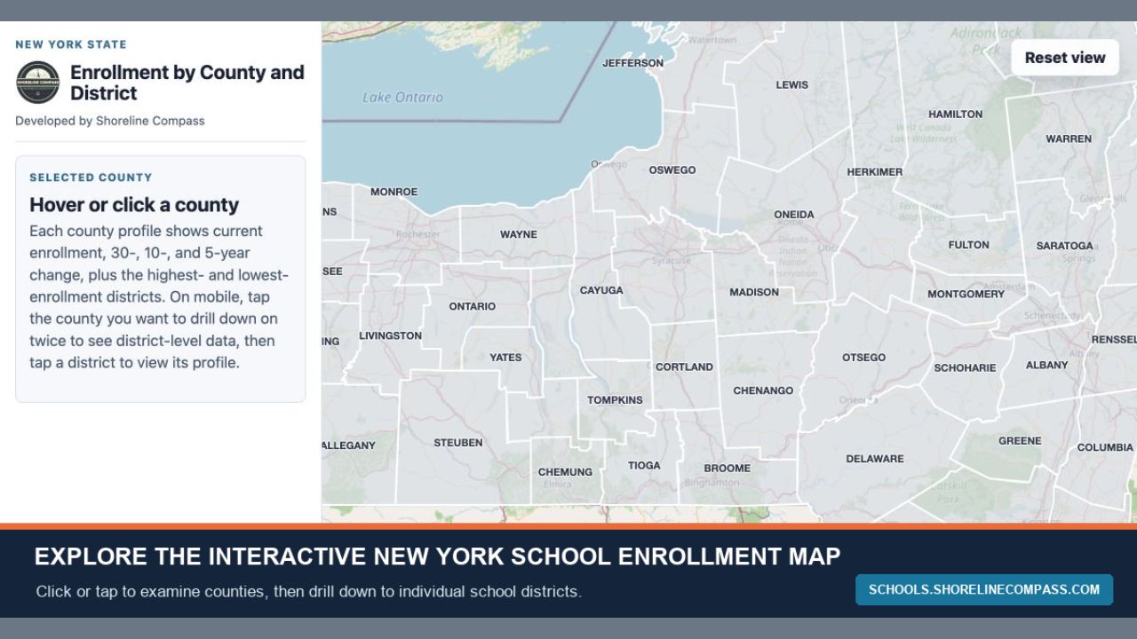
In today’s column, I write about a project I’ve been working for a few months. It’s a K-12 enrollment map covering every district in New York State. It was built using publicly available NYSED data. You can drill down to individual districts, see what the changes have been, and see how districts around you are performing. It’s pretty straightforward to use, and the tab on the left allows you to toggle between enrollment and economic disadvantage. I’ll be writing about what I’ve found pulling all the data together and combing through it, so stay tuned for that and subscribe if you want to come along on the journey.
The data is flashing a warning sign
It’s back-to-school time.
Within the next two weeks, kids across Upstate New York will head back to school, embarking on another academic year. So, too, will parents and teachers.
For the last few school years, we’ve heard a lot of thematic reporting about what’s happening inside those schools: teachers facing burnout and the profession losing young talent, shortages of bus drivers forcing districts into increasingly difficult choices, and educational outcomes that seem increasingly connected to the financial circumstances of individual families.
That last point is the one I keep coming back to.
I’m 36, and for the first 10 or 15 years after graduating high school, I listened as my child-bearing peers picked and chose their eventual homes based, at least in part, on school performance. In nearly every case, they gravitated toward districts with less poverty and a track record of overall success.
That conversation has shifted in the last handful of years.
When I see those same people now and we talk about their kids’ K-12 experience, the conversation pretty quickly gets around to how much more poverty they see around their children. These are people who intentionally bought homes in communities they believed would insulate them, at least somewhat, from the problems associated with concentrated economic hardship.
Except the margins have moved.
At the start of summer, I set out to visualize enrollment data. For those who’ve been following along for a while, you probably remember the tables I published annually showing enrollment decline across the region.
I wanted to make that data more interactive and easier to consume, so I put together two statewide maps breaking down changes in enrollment.
I linked to it above, but you can check them both out here.
Admittedly, the map is easier to use on desktop. That said, it gets the job done on mobile, too. It shows district-by-district enrollment change over three periods: 30 years, 10 years, and five years.
The question I was trying to answer went back to those conversations with parents: What’s actually changed?
Once the map was functional, I started digging deeper into the data. I excluded downstate districts, along with the four Upstate counties containing the region’s largest metropolitan centers: Albany, Erie, Monroe and Onondaga.
That left 409 complete K-12 public school districts across 48 Upstate counties, serving more than 540,000 students.
And the first thing the data makes clear is that the school system most Upstate communities built decades ago is serving a dramatically smaller population today.
Among the 400 districts with complete 30-year histories, 389 lost enrollment. Collectively, those districts lost more than 212,000 students, a decline of 28.5%.
Only 11 didn’t decline.
Meanwhile, 59% of the districts in the broader analysis now enroll fewer than 1,000 students. The median district has just 844.
This isn’t just some demographic hangover from the 1990s, either.
Enrollment declined another 11.4% over the last decade and 4.8% over the last five years. The rate of decline has actually moderated a tiny bit — an important distinction — but 84% of districts are still losing 13 students per year.
Scroll around the map and you’ll see variations in severity, but not much variation in direction. Every county included in the analysis recorded an aggregate 30-year decline. Delaware County lost 47% of its enrollment. Wyoming lost 44%. Yates lost 43.7%. Orleans lost 43%.
Even the comparatively stronger counties mostly just declined less.
And that brings me back to the question I started with: Why do parents feel like they’re seeing so much more poverty around their kids?
Because, proportionally, they are.
After getting the enrollment map figured out, I decided to look at another statistic tracked by the state Education Department: Economic disadvantage. There’s less historical data available — comparable figures only go back to the 2011-12 school year — but that’s enough to see what has happened.
Among districts with comparable data, economically disadvantaged students represented 40.8% of enrollment in 2011-12.
Today, they represent 46.2%.
That distinction needs to be understood. The actual number of economically disadvantaged students hasn’t exploded. In fact, it declined modestly.
The rest of the student population just declined much faster.
That’s how you end up with fewer kids overall but a substantially greater concentration of economic need inside the schools.
And this is where the enrollment story becomes something much bigger than enrollment.
If the population is declining, enrollment is declining, and the concentration of need is increasing, the cost of delivering the same quality of education doesn’t decline with the number of students.
A school district that loses 100 kids doesn’t get to eliminate 10% of its building. It can’t eliminate 10% of a bus route, 10% of a guidance counselor, or 10% of the specialized services it’s required to provide.
Buildings, transportation, administrators, teachers, counselors, technology systems, and mandated services all have fixed or semi-fixed costs.
That’s the problem.
We tend to think about population decline as subtraction: Fewer people means fewer services, fewer employees, and lower costs.
But that just isn’t how it works. I’ve written about that repeatedly in recent weeks.
A district with 800 students still has to provide an education. It still needs transportation and administrators. It still needs special education services, counselors, buildings, and enough teachers to offer students something resembling the educational opportunities available in larger districts.
That’s why declining enrollment is becoming a structural problem that districts don’t have a ton of great options to remedy.
I’m going to be writing a lot more about this over the next couple of weeks because there are several pieces of this worth pulling apart: Transportation, staffing, buildings, state aid, property taxes, shared services, and what regionalization actually looks like when communities are fiercely protective of their local schools.
But I wanted to start here because it fits within the theme of my last few columns.
The data matters.
And the data is telling us something not-so-great: Many Upstate communities are trying to maintain school systems designed for populations they no longer have, while serving a remaining student population with a significantly greater concentration of need.
I’m not painting a picture of one, singular outcome here — although, I do believe a lot of districts are going to merge in the coming years. The math underpinning the system itself has changed, and the people in these districts — from teachers, to administrators, to taxpayers — should start considering what the future might look like.
The question isn’t whether Upstate New York can somehow reverse 30 years of decline before it has to confront that reality. It’s how communities redesign educational delivery, staffing, facilities, and regional cooperation around the students and families already here.
Because eventually, something has to give. And it will.
But, if communities wait until the math forces the decision, they’re probably not going to like the choices they have left.
Thanks for reading In Focus! Subscribe for free to receive new posts.